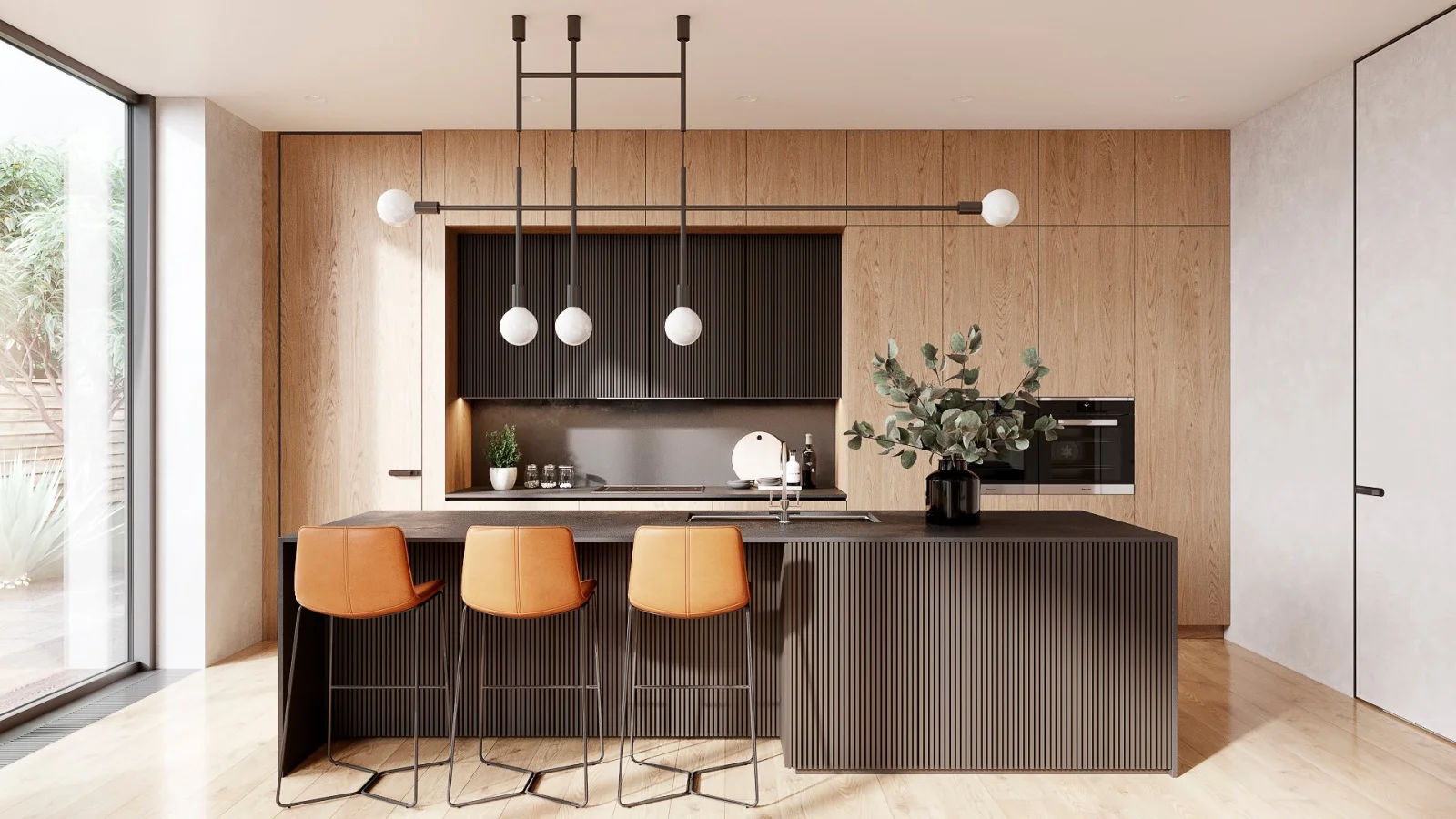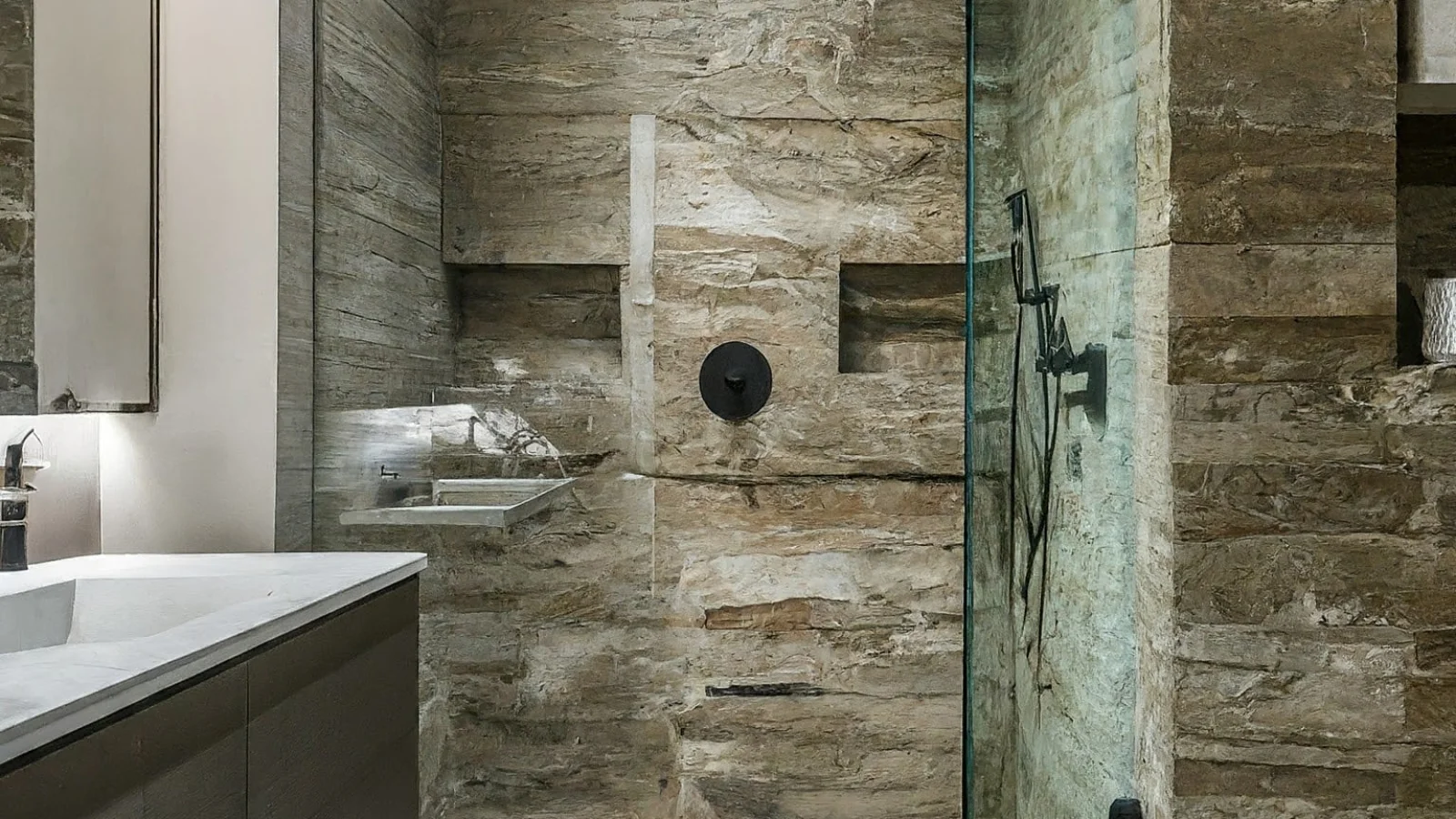
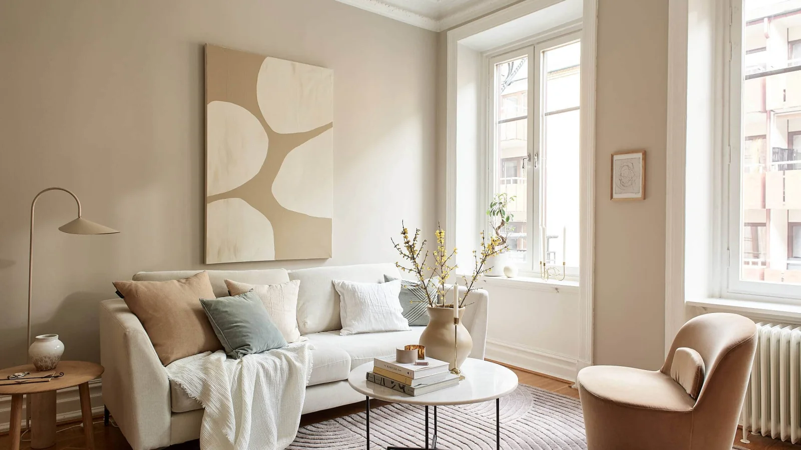
Beige, sand, greige, clay and cream... Warm neutrals give a space a timeless, calm character. We share the subtleties of choosing colour, from picking the right undertone and building a palette to the effect of light and common mistakes.
Colour is one of the most powerful tools for setting the mood of a space. In recent years, cool greys and stark whites have increasingly given way to warmer, more natural tones. The palette we call warm neutrals covers sand, beige, cream, greige, clay and soft brown tones. These colours suit both modern and classic spaces, adapt easily to changes in furniture and accessories, and bring calm to the people who live with them.
Why warm neutrals?
- They are timeless: Trend colours date within a few years; warm neutrals stay current for a long time.
- They suit natural materials: They form a seamless whole with wood, stone, linen, rattan and terracotta.
- They soften light: They do not bounce the harsh Mediterranean sun around and tire the eyes as cool whites do.
- They calm: They create a restful backdrop in bedrooms, living rooms and work areas.
Undertone: not every beige is the same
The most overlooked aspect of choosing colour is the undertone. Placed side by side, one beige may look pinkish while another looks yellowish or greenish. Warm neutrals usually carry yellow, peach or reddish undertones. To choose correctly:
- Assess the colour next to a sheet of white paper; the undertone shows more clearly.
- Check how it works with the undertones of fixed elements such as flooring, cabinets and worktops.
- If you are using several neutrals together, choose them from the same undertone family.
Light changes colour
The same paint looks cooler and greyer in a north-facing room and warmer and more yellow in a south-facing one. The colour temperature of the lamps you use in the evening also affects the result. So:
- Paint a large sample board in your chosen colour and try it on different walls,
- Observe the colour separately in the morning, at midday and in the evening,
- Choose warm white bulbs (around 2700–3000K) for evening lighting.
Four example palettes
1. Sand and linen
Light sand on the walls, natural linen curtains and light oak flooring, with wicker and rattan as accents. An airy, calm choice for small flats and holiday homes.
2. Greige and walnut
Greige walls — between grey and beige — combined with walnut furniture and brass details create a more sophisticated, modern feel. Suitable for living rooms and studies.
3. Cream and terracotta
Textiles and ceramics in terracotta, clay and rust tones on a creamy white base. The palette that best reflects the warmth of Mediterranean and Aegean interiors.
4. Clay and olive
Soft clay-toned walls with olive and sage green accents. Very effective in living spaces that open onto the garden and connect with nature.
The 60-30-10 rule
Interior design often uses a simple method to build a balanced palette: roughly 60% of the space is the main colour (walls, large surfaces), 30% the secondary colour (furniture, curtains, rugs) and 10% the accent colour (cushions, objects, artwork). In warm neutral palettes, the main and secondary colours can come from the neutrals, while the accent can be a more saturated tone.
Common mistakes
- Lack of texture: A completely neutral space can look dull without variety in texture. Add layers with linen, wool, wood, stone and ceramics.
- No contrast: A slightly darker tone (brown, anthracite, walnut) adds depth to the space.
- Mixing different undertones: A beige with a pink undertone next to a greige with a green undertone can clash.
- Relying only on a swatch card: A small card does not show the effect on a large wall.
Conclusion
When warm neutrals are combined with the right undertone, well-planned lighting and rich textures, they bring both warmth and calm to a home. At Nest Yapı Mimarlık we support colour consultancy with 3D visualisation, showing how your chosen palette will look in your space before any work begins.